The Art of Creating Videos for Ecommerce That Convert: A Designer's Guide to Visual Storytelling

Why Video Design Matters More Than Ever in 2025
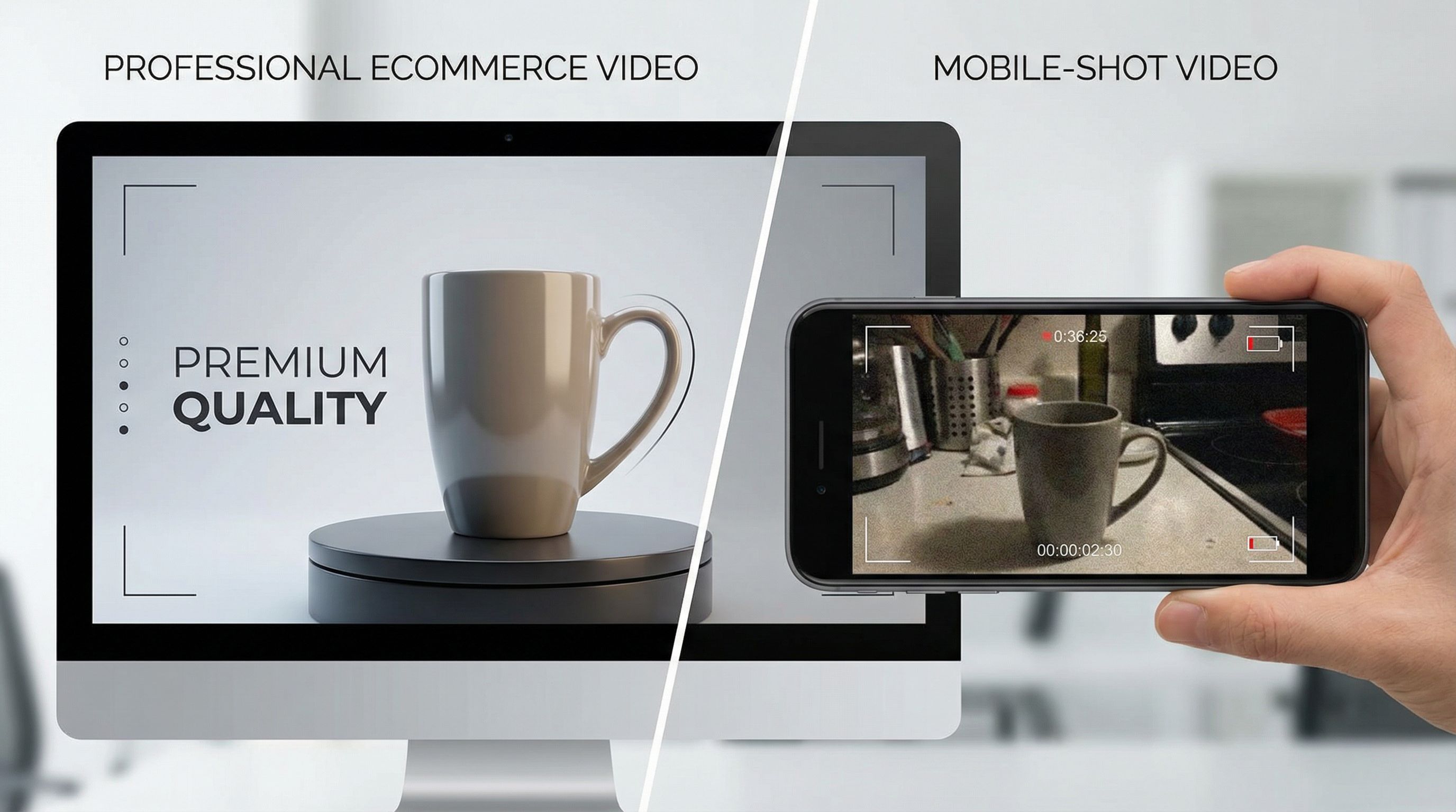
If you're still debating whether to invest in ecommerce video, stop. The numbers aren't suggestions—they're a wake-up call. According to Shopify's 2025 Video Marketing Trends Report, 93% of marketers say video has given them a solid ROI, and 89% of consumers claim videos have convinced them to make a purchase. But here's the thing: not all videos are created equal.
The difference between a video that converts and one that gets skipped comes down to design. As designers, we're responsible for translating product value into visual language that stops the scroll, holds attention, and ultimately drives action.
Consumers now spend an average of over 100 minutes daily watching online videos, and short-form video is expected to dominate 90% of internet traffic by 2025. This isn't just about being where your audience is—it's about being there with content that's visually arresting and strategically designed. The brain processes visual information 60,000 times faster than text, which means your design choices in those first three seconds will determine whether someone keeps watching or moves on.
What's particularly interesting is that video quality directly impacts trust. Research shows that 91% of consumers say video quality affects their trust in a brand, making production value not just a nice-to-have but a critical business asset. Whether you're working with high-end production teams or scrappy DIY creators, understanding visual design principles is what separates content that converts from content that just exists.
Master the Foundation: Composition and Visual Hierarchy

Let's start with the fundamentals that separate professional product videos from amateur attempts. Composition is where we establish visual hierarchy—the invisible guide that tells viewers what to look at and when.
In ecommerce video design, you're working against cognitive overload. Your viewers are scrolling through dozens of videos daily, and you have about 8 seconds to capture their attention. That's where intentional composition becomes your secret weapon.
Think about how you're framing your product. The rule of thirds still applies in video, but in ecommerce, we often push it further. Center-weighted compositions work exceptionally well for product-focused videos because they eliminate visual noise and keep the product as the undeniable focal point. However, lifestyle videos—where you're showing the product in context—benefit from more dynamic compositions that create depth.
Color blocking is a technique I've found invaluable. By using large areas of complementary color to frame your product, you create immediate visual separation. If your product is a deep navy blue, surround it with warm neutrals or subtle gold tones. This isn't accidental—it's strategic visual design that makes products "pop" without feeling gimmicky.
Whitespace, or negative space, is your friend here too. When designers first learn about composition, they often make the mistake of filling every pixel. In product videos, restraint is elegance. The more open space around your product, the more premium and intentional it feels. A beautifully lit product with generous breathing room will always outperform a cluttered frame, even if the clutter is technically more informative.
One actionable tip: during pre-production, create clear compositional "zones" in your frame. The center zone belongs to your hero product. The outer zones should support, not compete. Use depth of field (foreground, subject, background) to guide the viewer's eye on a specific journey through the frame.
Color, Typography, and the Psychology Behind Your Choices

Color in video isn't decorative—it's psychological. Every color choice you make sends a message before your viewer even processes the product itself.
Let me be direct about what I've learned from designing dozens of product videos: color consistency is more important than color boldness. If your brand is built on a specific color palette, maintain it obsessively throughout your video. This creates instant brand recognition. But here's where it gets interesting: in ecommerce videos, you often want to make the product color the hero, which means your supporting colors (backgrounds, text, accents) need to recede.
For background colors, I use what I call the "60-30-10 rule"—60% dominant color (usually neutral), 30% secondary color (brand accent), and 10% tertiary color (highlight/contrast). This keeps videos visually harmonious without feeling flat. Warm neutrals (creams, taupes, warm grays) tend to feel premium and are easier on the eye during multiple watches. Cool neutrals work beautifully for tech products because they feel modern and clean.
Contrast is your silent tool for driving conversions. According to the latest research on visual design principles, high contrast between your product and background increases visual engagement dramatically. This doesn't mean neon and chaos—it means thoughtful contrast that makes the product the visual winner without question.
Now, typography in video requires a different mindset than web typography. Your text needs to be readable at half-screen size (because people are watching on phones), legible at high speeds (because viewers might not watch every frame), and emotionally aligned with your brand.
I've noticed that sans-serif typefaces typically perform better in product videos because they're cleaner and more modern. But more importantly, type hierarchy needs to be aggressive. Your main text should be about 3-4 times the size of supporting text, and you should use weight differences generously. Bold headlines + light body copy creates natural reading flow.
One specific technique that's worked consistently: animate your type in, but keep the animation subtle. A 300-400ms fade-in or slide-in looks polished without feeling outdated. Avoid bouncy or overly decorative animations—they distract from your product and scream "marketing video" in a way that kills authenticity.
The Power of Short Form and Silent Viewing Strategy
If you're still making product videos longer than 15 seconds, you're designing for a version of the internet that doesn't exist anymore. 85% of viewers prefer content under 15 seconds, and here's what that means for your design: every single frame has to earn its place.
When I'm designing short-form ecommerce videos, I think of it like visual poetry—every element is essential, nothing is accidental. The composition needs to be stronger, the color choices bolder, and the transitions snappier than longer-form content. This is where your design expertise really shines because you're creating maximum impact with minimum runtime.
But here's what many designers miss: 63% of branded content on mobile feeds is optimized for silent viewing with captions and graphics. This changes everything about how you approach the visual design. Your video cannot rely on audio to communicate. Every piece of critical information—the product benefit, the call to action, the value proposition—needs to be visually clear.
Silent video design means you're doing double duty: the video itself is telling the story through composition, pacing, and visual transitions, while on-screen text is providing the explicit messaging. The visual narrative and the text narrative need to work in parallel, not compete.
Here's my practical approach: when designing silent videos, I use strategic text overlays that appear exactly when the visual tells that part of the story. Product spinning into frame? "Available in 5 colors" appears at the same moment. Hero shot of someone using the product? "Fits your lifestyle" appears. The text isn't replacing the visual storytelling—it's amplifying it.
Transitions between shots need to feel intentional and swift. I've found that clean cuts work better than fancy transitions in short-form ecommerce videos. A smash cut paired with a quick audio pop (even in a "silent" video, subtle sound design matters) creates energy and keeps momentum. The Goldilocks principle applies here: you want pacing that feels dynamic but not frantic, energetic but not chaotic.
For mobile viewing specifically, research shows that vertical videos yield 130% higher engagement rates compared to horizontal videos. So design for vertical (9:16) as your primary format, then adapt for other ratios. Don't just crop horizontal videos—redesign the composition for vertical. The product might occupy more of the frame in vertical because you have less width to work with, which often creates more intimate product shots anyway.
Storytelling Through Visual Design: Beyond Product Specs

This is where your design work transforms from functional to compelling. The most converting ecommerce videos don't just show products—they tell stories about transformation, aspiration, and solution.
When I'm conceptualizing a product video, I don't start with the product. I start with the customer's need or desire. A skincare product isn't about ingredients; it's about feeling confident. A kitchen tool isn't about features; it's about creating meals for people you love. Your visual design needs to communicate this emotional core before it ever communicates product specifications.
This is where color psychology gets even more sophisticated. If your brand story is about sustainability and authenticity, your color palette and visual style should reinforce that. Earthy tones, natural lighting, organic compositions. If your story is about innovation and precision, then clean geometric compositions, bold color contrasts, and modern typography. The visual design becomes inseparable from the narrative.
One technique that's working exceptionally well in 2025: the "before-after-with" visual structure. Rather than showing product features, show the customer's journey. Frame 1 (Before): Relatable problem or mundane moment. Frame 2 (With): Customer using your product. Frame 3 (After): The benefit or transformed state. This creates narrative arc using only visuals.
Brands like Glossier have mastered this by integrating shoppable features into authentic customer routines, turning what would be ordinary moments into aspirational content. The design here is understated but intentional—nothing feels overproduced, which actually increases trust.
Focus on showing, not telling. As the saying goes in visual design, "show, don't tell." Instead of text saying "durable," show the product being used in a way that clearly demonstrates durability. Instead of saying "luxury," design every frame—from lighting to composition to color grading—to feel premium.
Pacing in storytelling videos is different than in pure product demos. You need breathing room for the narrative to land emotionally. A shot holds longer, transitions are gentler, and music/sound design (if you're using it) has more time to work. But even here, keeping videos to 35 seconds or less, with a maximum of 2-3 minutes, ensures optimal effectiveness. Constraint is creative.
Design Systems for Consistency and Performance

If you're creating multiple product videos for an ecommerce brand, consistency isn't just nice aesthetics—it's a conversion driver. When viewers encounter your second, third, or fifth video, they should immediately recognize it as part of your brand's visual language.
I create what I call a "video design system" for brands: defined color palettes that can flex, typography rules for text overlays, composition guidelines (golden ratios, safe zones for text), transition templates, and even audio design principles. This isn't restrictive—it's liberating. When your foundational design language is locked in, you can experiment creatively within those boundaries.
Here's the practical structure I use:
Color System: Your primary brand color, secondary accent color, three neutral backgrounds (light, medium, dark), and three accent colors for callouts. Every video uses this palette. This creates immediate visual cohesion across a product catalog.
Typography Hierarchy: One display typeface for headlines, one sans-serif for body text. Specific size relationships (headlines are 48px, subheads are 28px, body is 16px—adjust for your brand). This makes text overlays feel intentional rather than random.
Composition Framework: Define safe zones where critical elements (product, CTA) always appear. Mark zones where text never overlaps product. Create reusable layout templates for different video types (demo, lifestyle, testimonial).
Motion Language: If you're using transitions or animations, define them. "All product reveals use a smooth fade-in." "Text animates in from left at 0.3s speed." This consistency trains viewers' eyes.
From a practical standpoint, this system means a junior designer can create a video that feels like it belongs in your brand ecosystem. It also means you can batch-produce videos more efficiently because the foundational decisions are already made.
Performance-wise, consistency builds brand recognition, which according to research on video marketing effectiveness, directly increases conversion rates. Viewers who've seen one of your well-designed videos are primed to trust the next one. They're not cognitively processing the design because it feels familiar—they're focused on the product and the value proposition.
The last point on this: document everything. Create a video design brief for your brand that includes your design rationale. Why did you choose that color palette? Why does that typeface represent your brand? This documentation helps you stay consistent and helps new team members understand the "why" behind your design decisions, not just the "what."